top of page

REBRAND

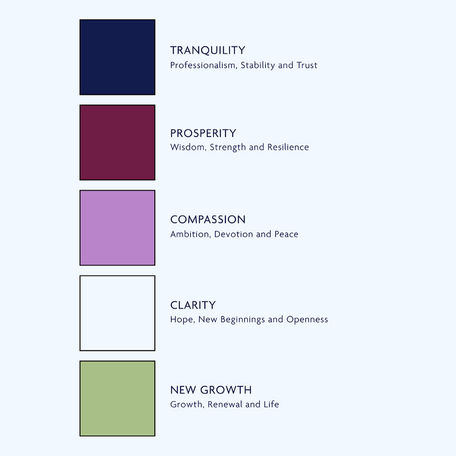
When our long time partner, Oxford OB/GYN, came to us ready for a refresh of their brand, we jumped at the chance to help! We knew their business would need a brand mark that was distinctly feminine. Something that was both soft and strong, just like the women they serve. The look they ultimately decided on features an abstraction of a humming bird + leaf. Each of these elements are chock-full of symbolism. We hope you’ll take the time to read about this rebrand in full on our blog.
Creative
Logo
Colors
Fonts
Brand Guidelines
Letterhead
Email Signatures
Apparel/Promotional Item Options


bottom of page


